- AtoZ Cursive
- Cursive V
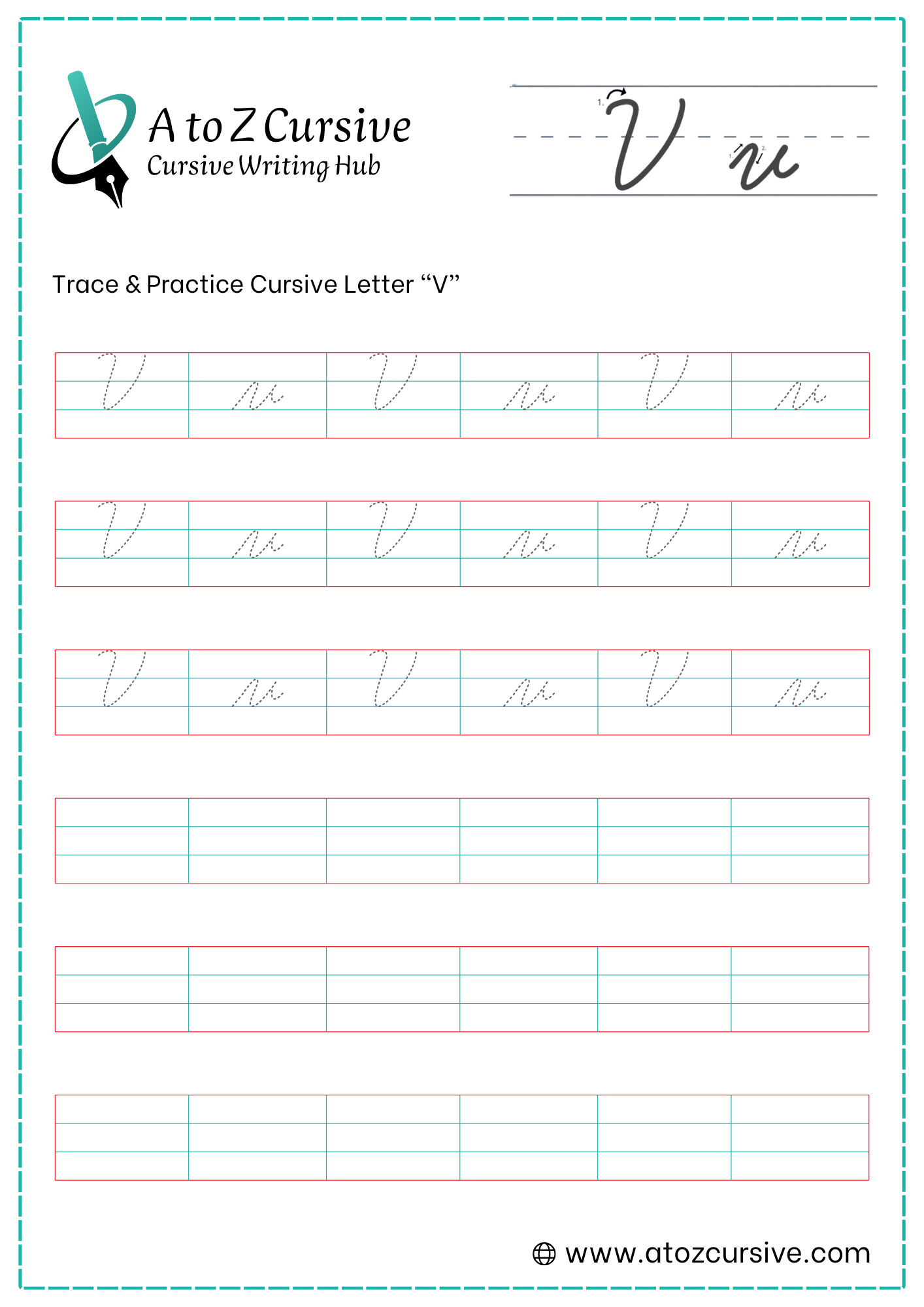
Cursive V: Tutorial & Printable Worksheets (Uppercase + Lowercase)
Learn how to write uppercase and lowercase cursive V with step-by-step instructions. Download free printable worksheets to practice and improve handwriting easily.
How to Write V in Cursive
Learn to write cursive V step by step! Follow simple, flowing strokes to form both uppercase and lowercase letters neatly and connect smoothly to the next letter.
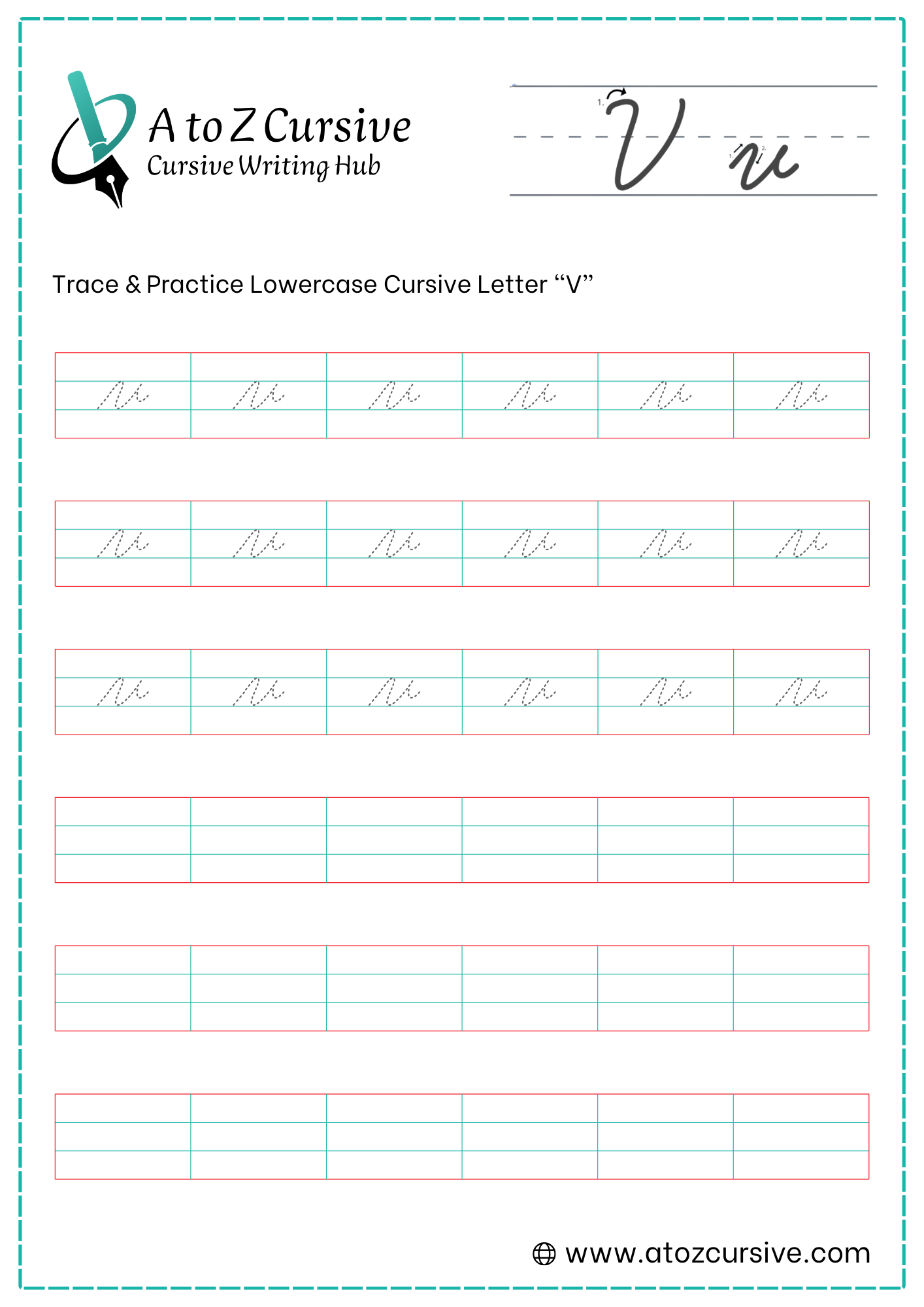
Lowercase Cursive V
-
Start on the baseline. Sweep upward and to the right until you reach the midline.
-
Curve at the midline and pull a slanted line down to the baseline. Unlike the "u," the bottom of a cursive "v" is often slightly more pointed or a very tight curve.
-
Sweep back up to the midline, keeping this line parallel to your first stroke.
-
Once you hit the midline, do not go back down! Instead, make a small, horizontal flick or "bridge" to the right. This is where you will connect to the next letter.
"v" vs. "u": "u" has a retrace and ends at the baseline.
"v" has no retrace and ends at the midline.
The Pointed Base: While some styles allow a rounded bottom, giving the "v" a slightly sharper point at the baseline helps distinguish it from other letters.
Keep it Narrow: A "v" is a slim letter. If you make the valley too wide, it can start to look like the first half of a "w."
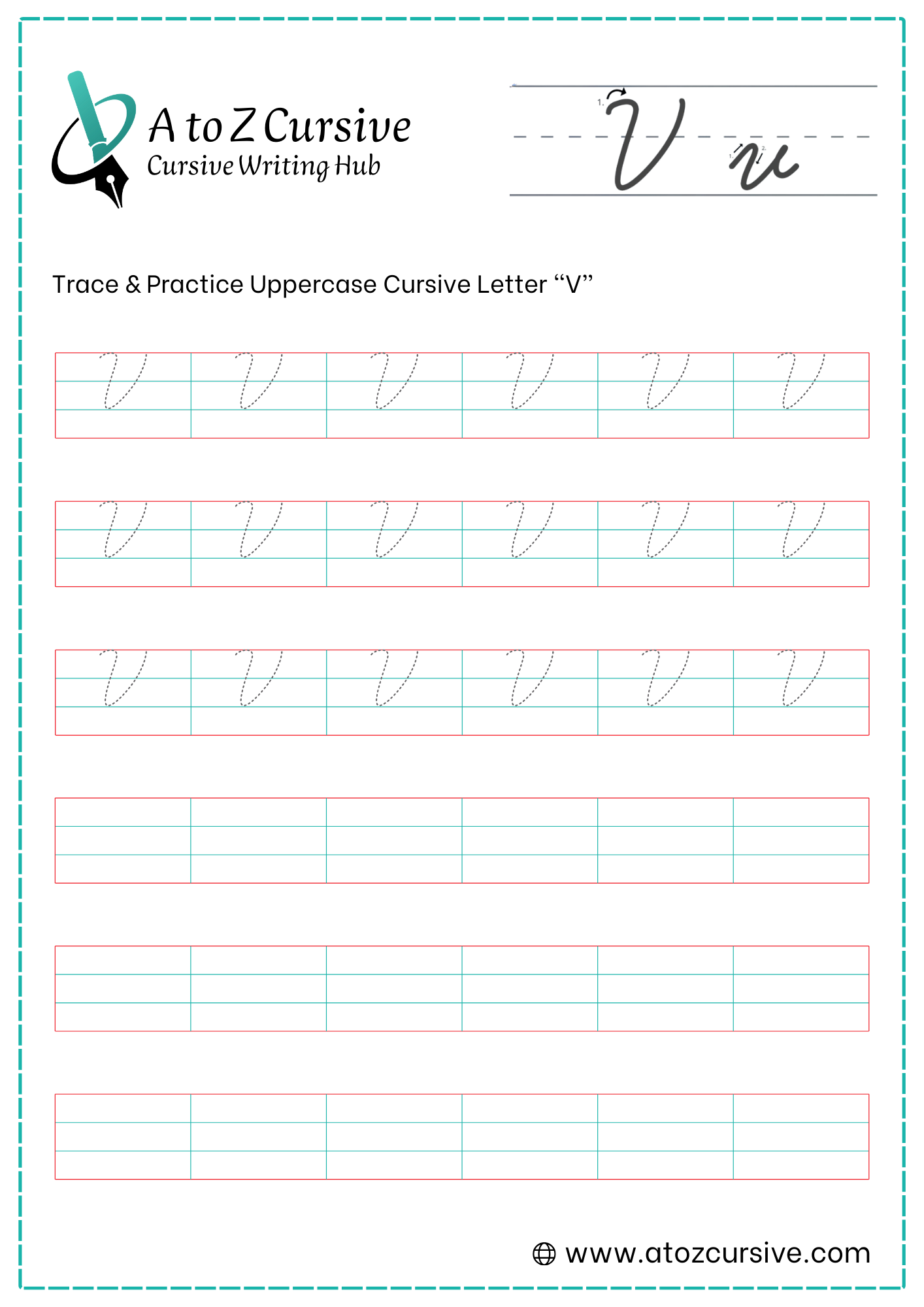
Uppercase Cursive V
-
Start just below the top line. Create a small "cane" or hook that curves up to touch the top line and then heads straight down.
-
Pull your pen down to the baseline, then curve smoothly to the right and sweep all the way back up to the top line.
-
This is the most important step for a clean look. Once you reach the top line, retrace your pen down that same vertical line you just made.
-
As you get close to the baseline, pull the stroke away from the stem and flick it out to the right to create the connecting tail.
Parallel Power: The left side and the right side of the "U" should be perfectly parallel. If one leans more than the other, the letter will look like it's tilting.
The Retrace Rule: Beginners often make a loop on the second downstroke, which makes it look like a large lowercase "u" or an "o." Ensure you stay exactly on top of your line when coming back down.
Height Check: Unlike the lowercase version, the "U" must reach the top line (the ascender line).
Easy Connections: Because the "U" ends with a tail at the baseline, it connects effortlessly to any lowercase letter that follows (like "Un" or "Up").
FAQs
Begin by practicing the basic entry stroke from the baseline to the midline. Focus on smooth, flowing motions before attempting full words.
Ensure the valley at the bottom is slightly pointed, maintain consistent slant on both strokes, and keep the exit stroke horizontal for easy connections.
The cursive “v” does not retrace and ends at the midline, while the cursive “u” retraces the first stroke and finishes at the baseline.
Use the small horizontal “bridge” or flick at the midline to seamlessly connect to the following letter, keeping your handwriting fluid.
Start with a hook near the top line, pull down to the baseline, curve back up to the top line, retrace vertically, and finish with a connecting tail to the right.
Focus on parallel strokes, uniform slant, and consistent height for both uppercase and lowercase forms. Tracing worksheets repeatedly helps reinforce muscle memory.
Yes, avoid making the bottom too wide, retracing in the lowercase V (makes it look like “u”), or letting strokes tilt unevenly.
Absolutely. Start with slow, careful tracing for accuracy, then gradually increase speed while maintaining proper slant and shape.