- AtoZ Cursive
- Cursive S
Cursive S: Tutorial & Printable Worksheets (Uppercase + Lowercase)
Learn to write cursive S with ease! Download free printable worksheets and follow our step-by-step guide for uppercase and lowercase letter practice.


How to Write S in Cursive
Learn to write cursive S easily! Follow step-by-step instructions for forming smooth, flowing uppercase and lowercase letters for neat and confident handwriting.
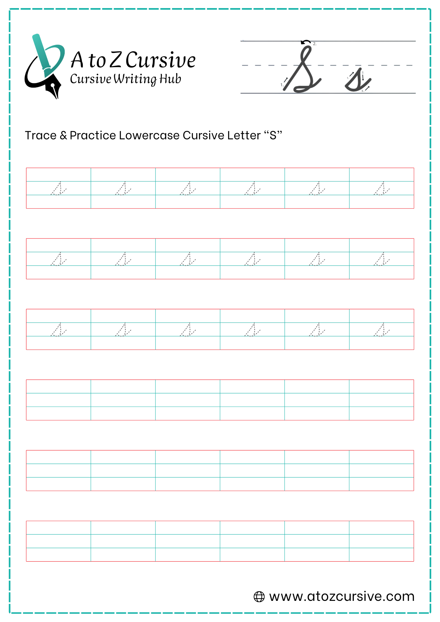
Lowercase Cursive S
-
Start your pen on the baseline. Sweep upward and to the right at a sharp diagonal slant until you reach the midline.
-
Once you hit the midline, make a sharp point (don't loop it!) and begin to curve backward and down toward the right.
-
Create a rounded curve that sweeps out to the right and then pulls back in toward the original upstroke, touching the baseline.
-
Bring that curve back to touch the initial upstroke. This "closes" the belly of the letter.
-
Retrace a tiny bit of that closure or simply flick the pen out to the right from the baseline to create the connecting tail.
Close the Gap: Make sure the "belly" actually touches the starting diagonal line. If it stays open, the letter might look like a lowercase "u" or a random squiggle.
Watch the Lean: The "s" relies heavily on its slant. Ensure the first stroke leans significantly to the right to give the "belly" room to form.
The "Boat" Shape: Some people think of the bottom of the "s" as the hull of a little boat resting on the baseline.
Uppercase Cursive S
-
Start your pen on the baseline. Sweep a long, diagonal line all the way up to the top line (the ascender line).
-
At the top, curve sharply to the left to create a narrow, elegant loop.
-
Sweep the pen back down and to the right in a large, rounded "belly" that fills the space between the midline and the baseline.
-
Bring that curve back toward the left until it touches the original upward stroke near the baseline.
-
Finish by pulling the stroke back out to the right. This "tail" is used to connect the "S" to the next letter.
The "Point of Intersection": The most important part of a professional "S" is where the belly crosses or touches the initial upstroke. This should happen right at or slightly above the baseline.
Mind the Slant: Ensure your initial upstroke has a strong rightward lean. This prevents the "S" from looking stiff or "upright."
Avoid the "A" Shape: If your top loop is too wide, the letter can start to look like an uppercase "A." Keep that top loop slender and focused.
Fluid Motion: Try to write the entire letter in one continuous, smooth movement without stopping. This helps maintain the "S" shape's natural grace.
FAQs
Start with free printable worksheets, focus on the upstroke, belly, and exit flick, and maintain a smooth, continuous motion for consistent letters.
Begin with a long diagonal upstroke, create a narrow top loop, form a rounded belly, and finish with a connecting tail to maintain fluidity.
Yes! Both uppercase and lowercase cursive S have an exit flick designed to connect smoothly to the next letter in a word.
Avoid rounding the top peak, leaving the belly open, making the top loop too wide, or breaking the letter into separate strokes.
Yes, you can download free printable cursive S worksheets to trace and practice both uppercase and lowercase letters.
Focus on maintaining a strong rightward slant, aligning the belly with the upstroke, and writing in a single, smooth motion.