- AtoZ Cursive
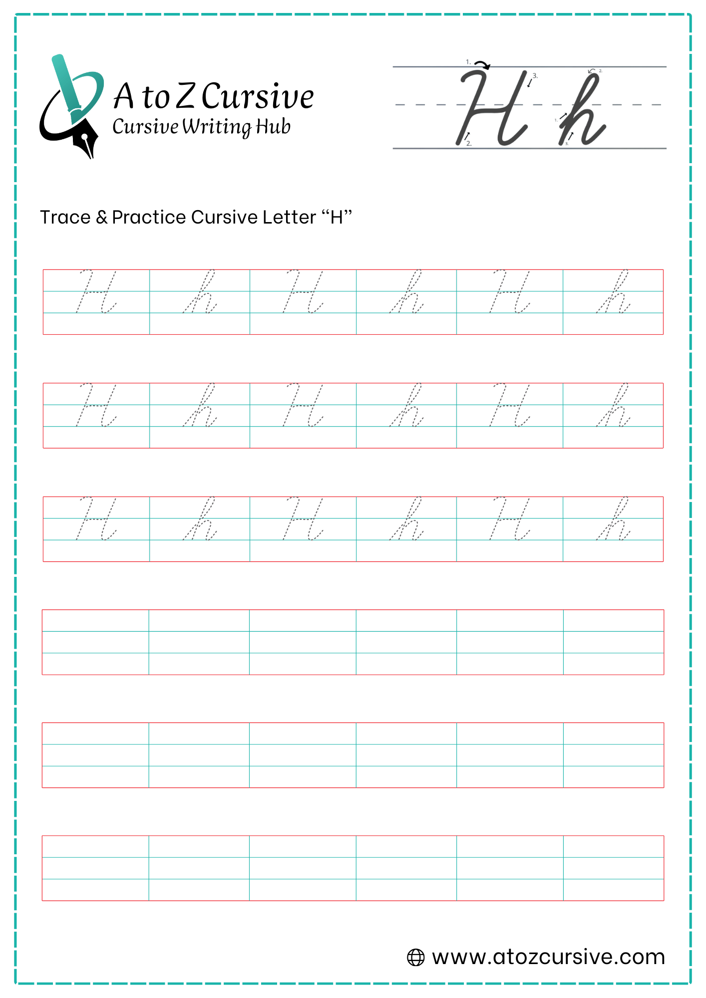
- Cursive H
Cursive H: Tutorial & Printable Worksheets (Uppercase + Lowercase)
This page teaches you how to form a cursive H neatly. Download printable worksheets to trace and practice both capital and small letters.
How to Write H in Cursive
Cursive H starts with a tall line and flowing arches that connect neatly to the next letter.
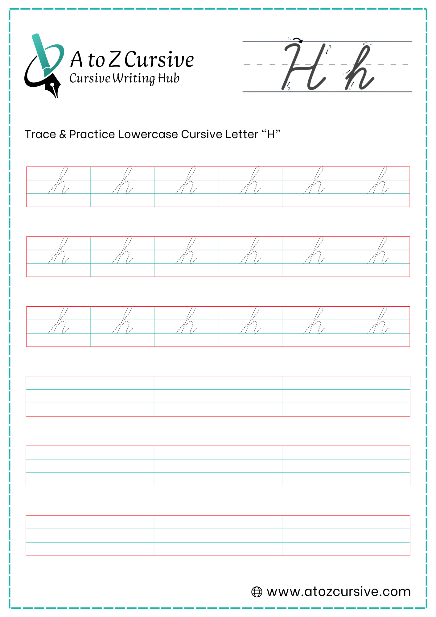
Lowercase Cursive H
-
Start at the bottom baseline. Sweep your pen up toward the top headline at a slight rightward slant.
-
At the top, curve to the left and pull a straight vertical line all the way back down to the bottom baseline.
-
Without lifting your pen, trace back up that same vertical line until you reach the midline.
-
Once at the midline, curve over to the right and back down to the baseline, creating a rounded hump.
-
Finish with a small upward flick to the right to connect to the next letter.
Height Difference: The first loop should reach the top line, but the hump should only reach the midline.
The Crossing: The lead-in stroke and the downward stroke should cross each other near the midline to create a balanced loop.
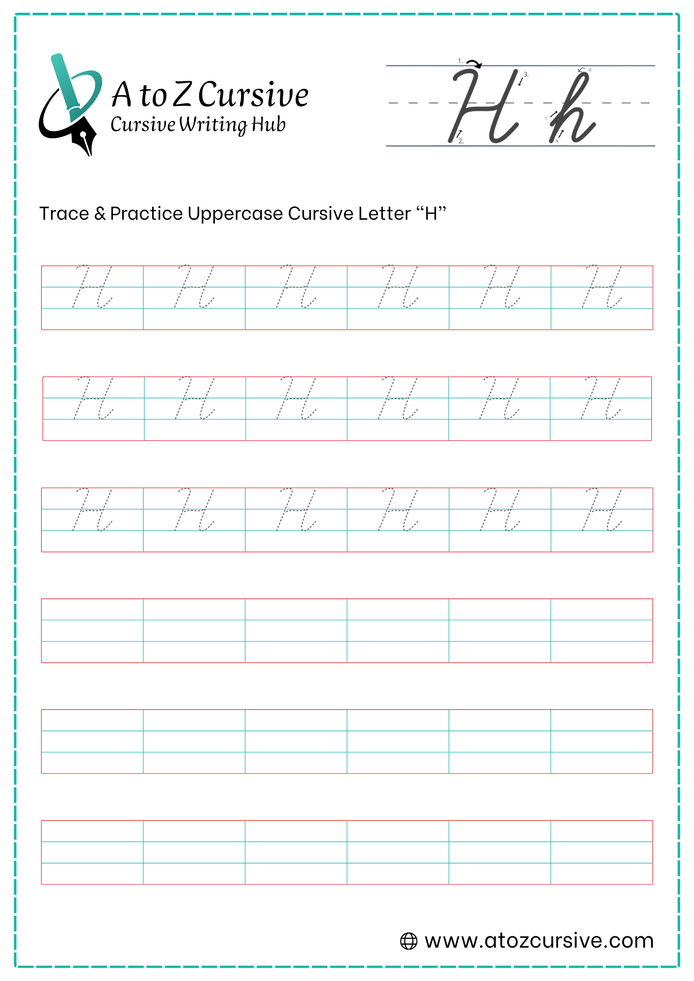
Uppercase Cursive H
-
Start just below the top headline. Make a small decorative loop or "hook," then draw a slanted vertical line down to the bottom baseline. Curve it slightly to the left at the very end (like a cane).
-
Lift your pen and move to the right. Start at the top headline again and draw another straight, slanted line down to the bottom baseline.
-
Without lifting your pen this time, trace back up that second line until you reach the midline.
-
From the midline, swing a loop to the left to "catch" or touch the first pillar.
-
Continue that loop back across to the right and flick it out past the second pillar. This tail is used to connect to the next letter.
Parallel Lines: Try to keep your two vertical "pillars" at the same slant so the letter doesn't look like it's falling over.
The Lift: Remember, this is one of the few times in cursive where you actually lift your pen off the paper mid-letter.
Connecting: The Uppercase H is a connecting letter. That final flick to the right is designed to lead directly into the next lowercase letter (like in the name "Harry").
FAQs
The easiest way is to start with a tall stroke, retrace upward, then add a smooth hump that connects naturally to the next letter.
Yes, cursive H is a tall letter. The first stroke reaches the top line, while the hump only rises to the midline.
Lowercase cursive H is written in one continuous motion, while uppercase cursive H usually requires lifting the pen during formation.
Uneven cursive H letters often happen when the vertical strokes are different heights or the hump goes too high or too low.
Yes, both lowercase and uppercase cursive H include a finishing stroke that connects smoothly to the next letter in a word.
Letters like a, e, i, r, and o connect smoothly after the cursive H due to its natural exit stroke.
Yes, tracing worksheets help beginners learn correct stroke order, spacing, and smooth connections for cursive H.
Retracing keeps the stem clean and helps the hump attach correctly, preventing gaps in the letter shape.
With regular practice, most learners can write cursive H neatly within a few days.