- AtoZ Cursive
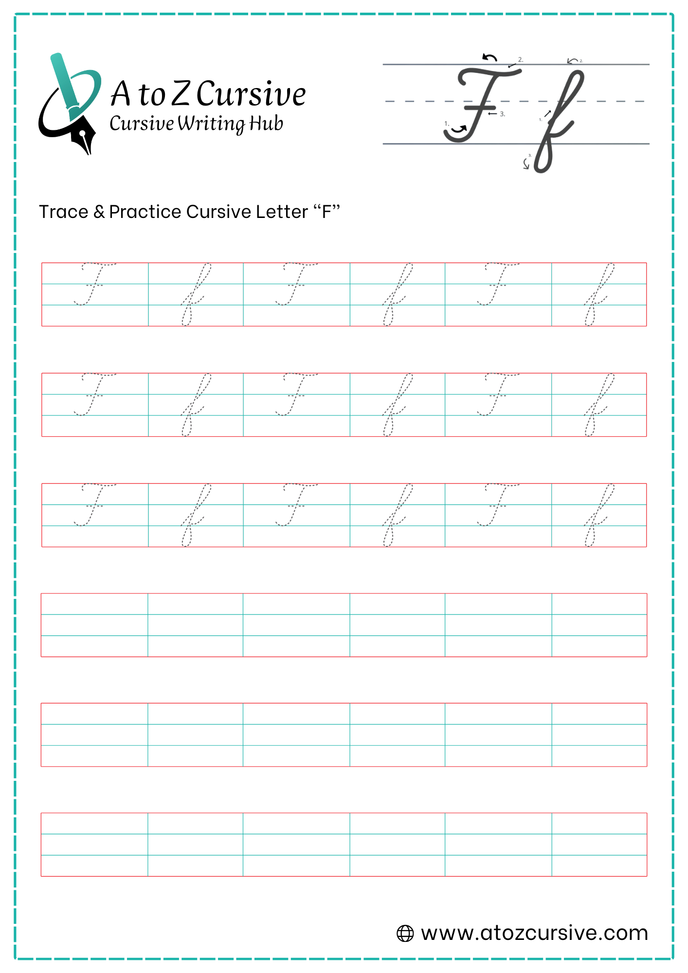
- Cursive F
Cursive F: Tutorial & Printable Worksheets (Uppercase + Lowercase)
On this page, you’ll get free printable cursive F worksheets for tracing and practice. Also, learn how to write uppercase and lowercase cursive F.
How to Write F in Cursive
Follow simple steps to write cursive F with proper curves, lines, and flow.
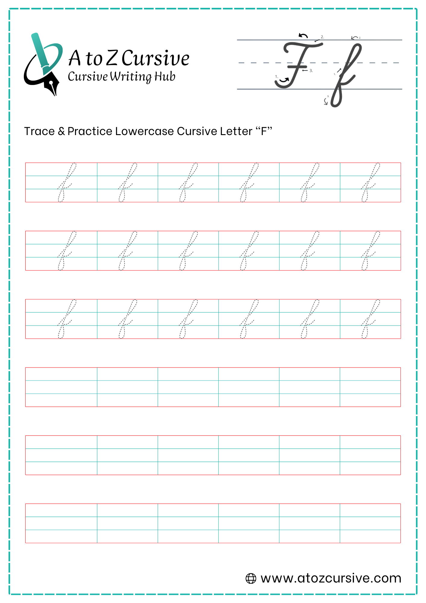
Lowercase Cursive F
-
Start at the bottom baseline. Draw a long, slanted stroke all the way up to the top headline, curving slightly to the right as you go.
-
At the top, make a sharp turn to the left to form a loop (similar to a lowercase "l") and draw a straight vertical line all the way back down.
-
Continue that straight line past the baseline and deep into the "basement" (the space below the bottom line).
-
Once you reach the bottom limit, curve the pen to the right and back up toward the baseline.
-
As you reach the baseline again, meet the vertical stem and make a tiny "knot" or a small horizontal flick to the right to connect to the next letter.
The Direction: Unlike the lowercase "q" or "g," the bottom loop of the f always curves to the right.
Keep it Lean: Because this letter is so tall and deep, keeping it on a slight slant helps it look elegant rather than clunky.
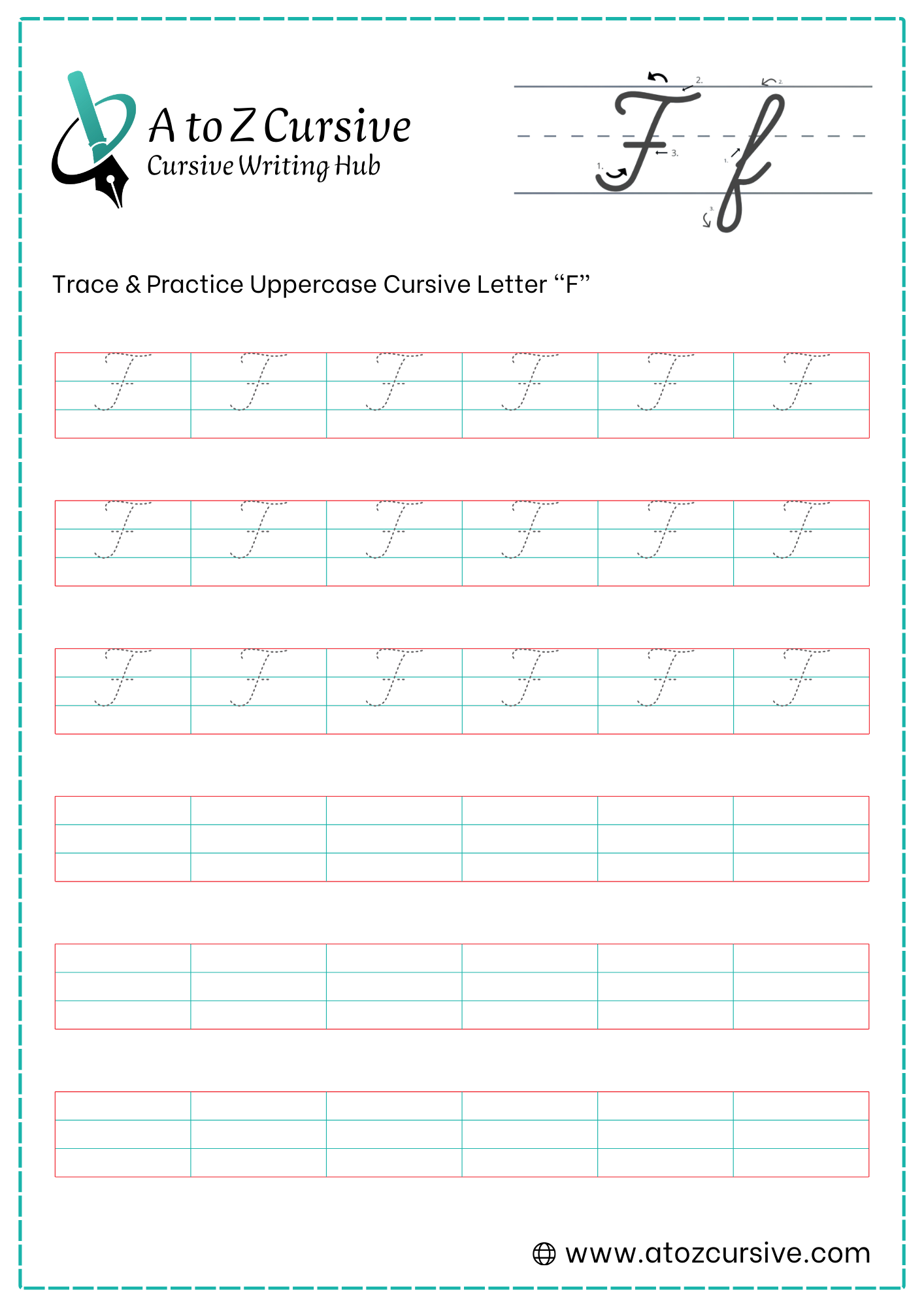
Uppercase Cursive F
-
Start just below the top line. Draw a wavy, horizontal stroke (like a flattened "S") that moves from left to right. This acts as the "hat" of the letter.
-
Place your pen in the center of that wavy cap. Draw a vertical line straight down to the baseline, adding a slight curve to the left at the very bottom (like a fancy candy cane).
-
Lift your pen and draw a short, straight horizontal line across the middle of the stem (at the midline). This "dash" is what makes it an F instead of a T.
-
Most people add a tiny downward "tick" or curl at the very beginning of the top cap for extra flair.
Lifting the Pen: Unlike many other cursive letters, the capital F requires you to lift your pen twice (once after the stem and once after the crossbar).
Non-Connecting: Usually, the capital F does not connect to the next letter in the word. You simply lift your pen and start the next letter right next to it.
Avoid the "T" Confusion: Always remember that middle dash! Without it, your F will look exactly like a cursive T.
FAQs
Cursive F may look tricky, but it becomes easy with slow practice and correct stroke order.
Start at the baseline, draw a tall loop to the top, come down below the line, and finish with a small connector.
Begin with a curved top stroke, draw a vertical line down, and add a short middle line to complete it.
Lowercase cursive F dips below the baseline to create its long tail and smooth letter connection.
Yes, both lowercase and uppercase cursive F can connect smoothly to the next letter in words.
Yes, A to Z cursive offer free printable cursive writing worksheets.
These worksheets are perfect for kids, beginners, parents, and teachers learning cursive handwriting.
Practice cursive F daily for a few minutes to improve shape, flow, and confidence.
No, cursive F can look slightly different depending on handwriting style, but the basic strokes stay the same.