- AtoZ Cursive
- Cursive Z
Cursive Z: Tutorial & Printable Worksheets (Uppercase + Lowercase)
Learn to write cursive Z easily! This page offers free printable cursive worksheets and step-by-step guides to practice both uppercase and lowercase cursive letters.
How to Write Z in Cursive
Write cursive Z with ease! Follow these simple steps to create neat, connected uppercase and lowercase cursive letters Z.
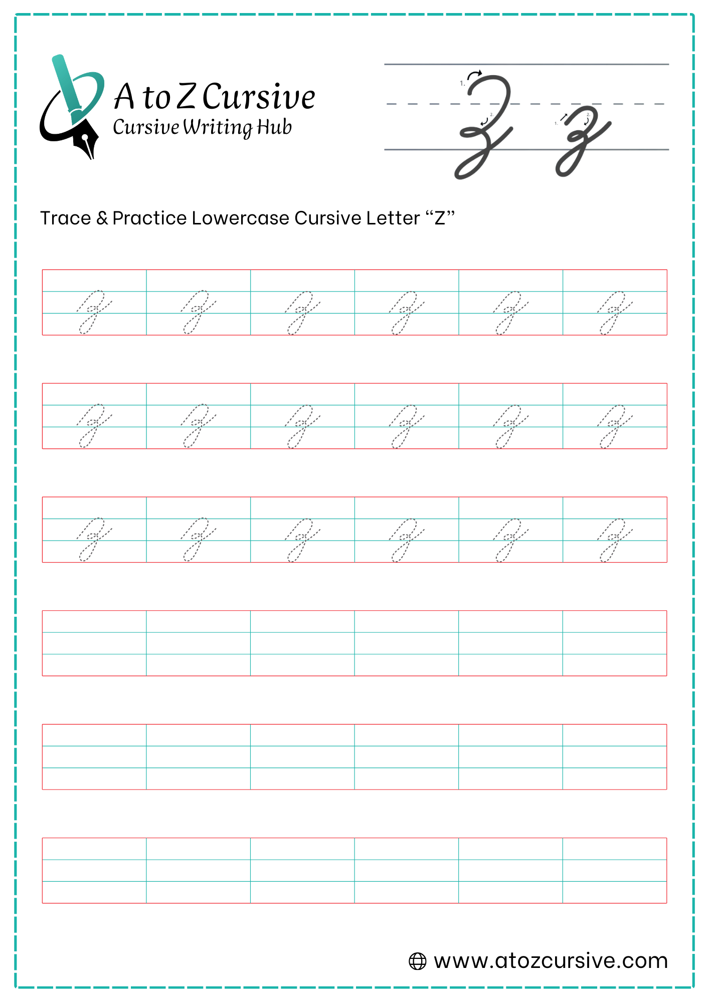
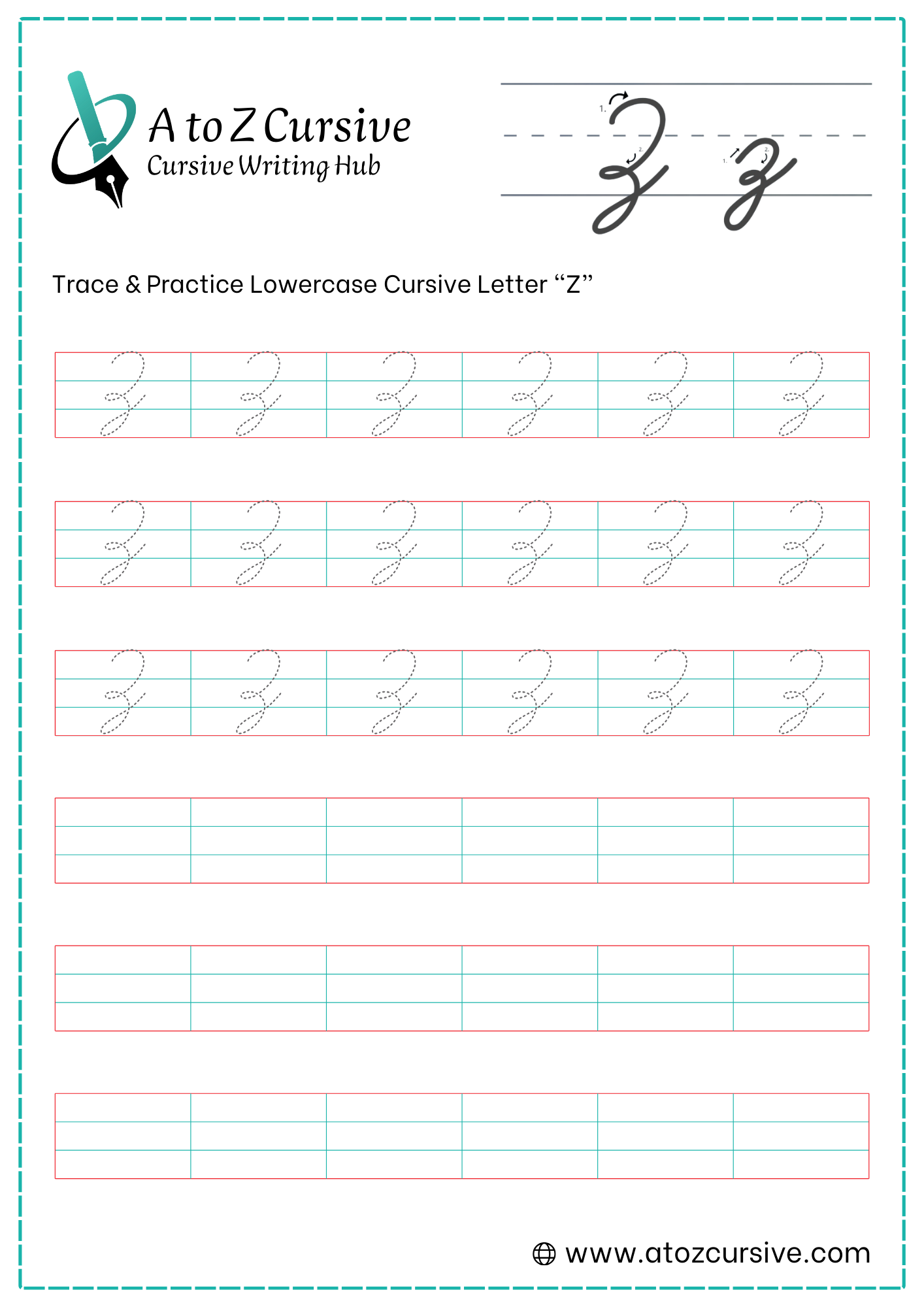
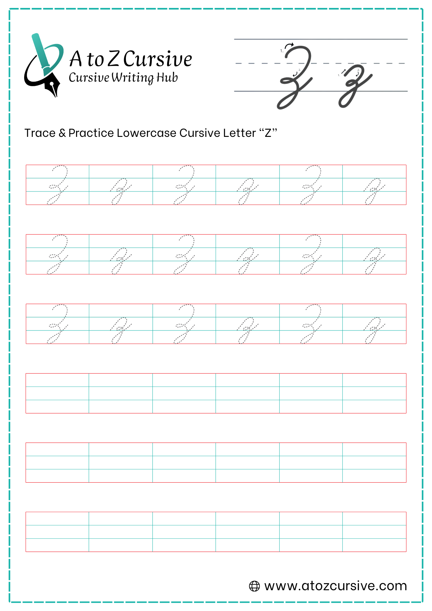
Lowercase Cursive Z
-
Start at the bottom baseline. Move your pen up to the midline in an over-curve (a small hump), similar to the start of an "n" or "m."
-
Bring the stroke down slightly towards the baseline, but before you touch it, create a tiny "shoulder" or notch.
-
From that notch, pull your pen down past the baseline into the lower zone (the space below the line).
-
Make a rounded loop toward the left, just like you would for a "y," "g," or "j."
-
Bring the stroke back up, crossing the vertical stem exactly at the baseline, and flick the tail to the right to connect to the next letter.
The Baseline "Neck": The narrowest part of the letter should be right at the baseline. This is where the top "hump" ends and the bottom "loop" begins.
Don't Rush the Notch: The little notch in the middle is what prevents it from looking like a messy "y." Make sure there is a distinct change in direction before you dive into the bottom loop.
One Continuous Motion: Unlike "x," the letter "z" is written in one single movement. Do not lift your pen until the letter (or the word) is finished.
Uppercase Cursive Z
-
Start just below the top baseline. Draw a rounded curve upward to touch the top line, then sweep it down and inward toward the midline. This forms the "head" of the letter.
-
Instead of finishing the curve like a "3," make a tiny loop or a "hitch" right at the midline. This acts as the joint between the top and bottom sections.
-
From that middle loop, create another rounded curve that moves down toward the baseline.
-
Just before you finish the curve at the baseline, pull the stroke straight down into the lower zone.
-
Create a loop to the left and sweep back up to cross the baseline, extending a tail to the right to connect to the next letter.
The Baseline Cross: Just like with Y and G, the neatness of your Z depends on the tail crossing the vertical line exactly at the baseline.
Sizing: The top "hump" should occupy the space between the top line and the midline, while the second "hump" sits between the midline and the baseline.
One Flow: Do not lift your pen! The capital Z is one continuous, elegant stroke.
FAQs
Simply click the “Download” button on this page to get instant access to ready-to-print practice cursive Z worksheets.
Start with an over-curve from the baseline to the midline, create a small notch, descend below the baseline, form a left loop, and finish with a connecting tail.
Begin with a rounded upper curve to the top line, add a small middle loop at the midline, draw a bottom curve to the baseline, and finish with a left loop and exit tail.
Write in one continuous motion, maintain proper slant, ensure the loops are proportionate, and pay attention to baseline intersections for a balanced, elegant letter.
Yes! Both lowercase and uppercase cursive Z can connect to the next letter using the exit tail at the baseline, ensuring smooth and flowing handwriting.
Yes. While X and Y have simpler strokes or double loops, Z includes a distinctive notch and long descending tail, giving it a unique flow and elegance.
Our free printable cursive alphabet worksheets are ideal for beginners, kids learning cursive, adults improving handwriting, and anyone practicing calligraphy or elegant cursive styles.