- AtoZ Cursive
- Cursive U
Cursive U: Tutorial & Printable Worksheets (Uppercase + Lowercase)
Learn to write cursive U easily! This page offers free printable worksheets and step-by-step instructions to practice both uppercase and lowercase cursive U neatly.
How to Write U in Cursive
Learn to write cursive U step by step! Follow easy instructions to form both uppercase and lowercase letters with smooth, flowing strokes for neat handwriting.
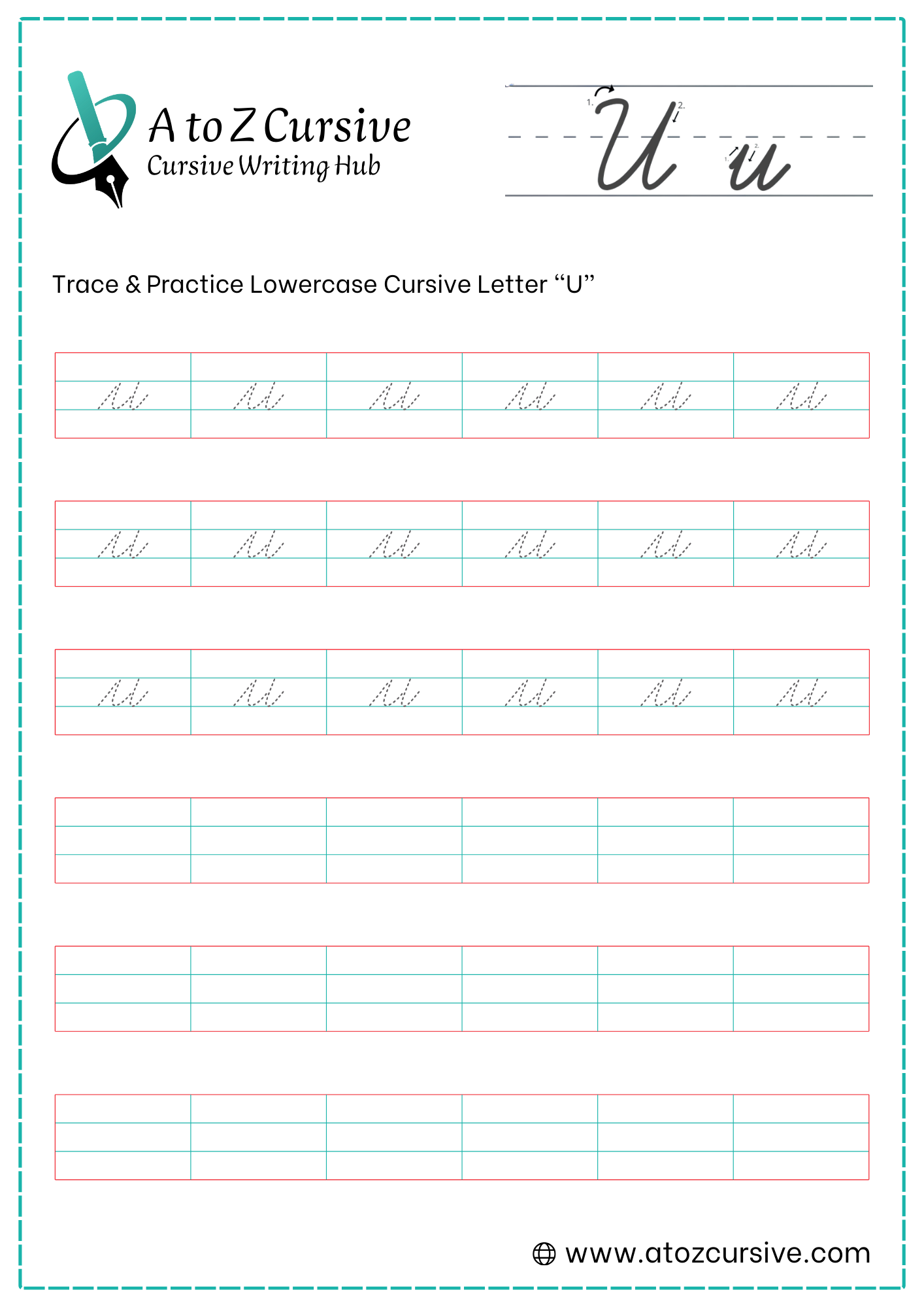
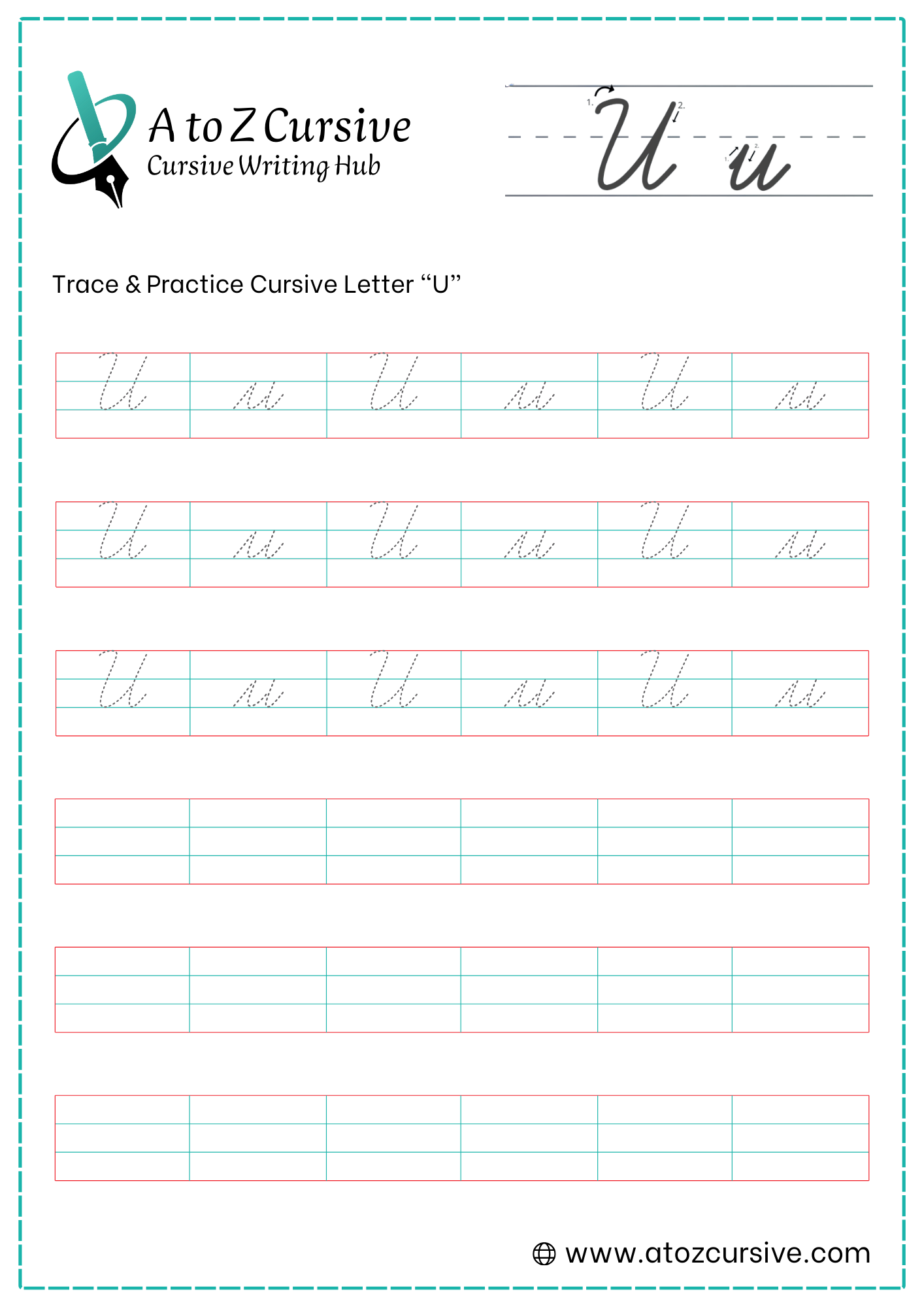
Lowercase Cursive U
-
Start your pen on the baseline. Sweep upward and to the right until you reach the midline.
-
Without lifting your pen, pull straight down to the baseline, then curve smoothly back up to the midline.
-
This is the secret to a clean "u." Once you hit the midline for the second time, trace back down the exact same line you just made.
-
As you approach the baseline, curve the pen out to the right to create the connecting tail.
Keep the "Valley" Wide: Ensure there is a clear space between your first upward stroke and your second downward stroke. If they are too close, it looks like a single line.
Parallel Slant: Both "arms" of the "u" should lean to the right at the same angle.
Uniform Height: Make sure both peaks of the "u" touch the midline.
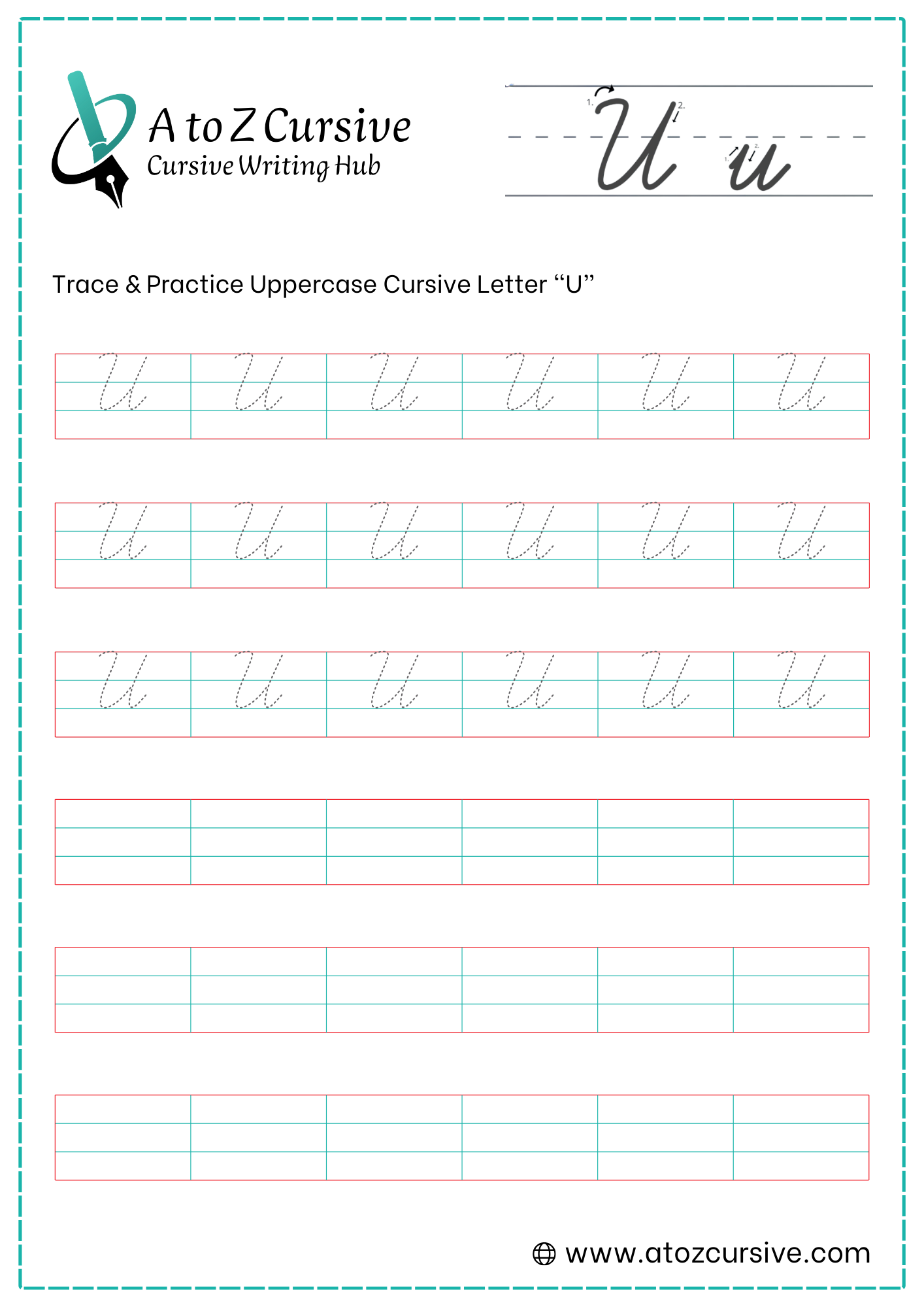
Uppercase Cursive U
-
Begin just below the top line. Start with a small downward hook or a "cane" shape that curves up to touch the top line.
-
Pull your pen down in a slanted line until you hit the baseline.
-
Sweep the pen along the baseline and curve back upward, heading all the way to the top line.
-
Once you hit the top line, do not lift your pen. Trace back down that same line toward the baseline (staying on the line until about the midline).
-
As you reach the baseline, curve the pen out to the right to create a tail. This tail allows you to connect the "U" to the next lowercase letter.
Full Height: Make sure both "arms" of the "U" reach the top line. If the second arm only reaches the midline, it will look like a strange version of a lowercase letter.
The "Retrace" Rule: The second vertical line should be traced back down. Avoid making a loop here; a solid, retraced line looks much more professional and clean.
Width Balance: Try to keep the "U" wide enough so it doesn't look like a tall, skinny "i," but not so wide that it looks like a "W."
Fluid Connection: Because the "U" ends at the baseline, it connects very naturally to letters like "n," "s," or "r."
FAQs
Start at the baseline, sweep up to the midline, pull down to form the first valley, retrace the second valley, and finish with a small exit stroke.
Begin just below the top line with a small hook, descend to the baseline, curve along the baseline upward, retrace the second vertical line, and finish with a connecting tail.
Yes! You can download free printable cursive U worksheets to trace and practice both uppercase and lowercase letters.
Avoid adding loops on the second downstroke, ensure peaks reach the correct height, maintain a parallel slant, and keep proper width to prevent confusion with letters like “n,” “i,” or “w.”
The lowercase and uppercase U both end with a tail on the right side, allowing smooth connection to letters like “n,” “r,” “s,” or “m.”
Practice regularly using tracing worksheets, maintain consistent slant and height, and focus on smooth, flowing strokes without lifting your pen between valleys.
Lowercase U has two peaks and starts at the baseline, while uppercase U starts with a top hook, has taller vertical arms, and spans from the top line to the baseline.