- AtoZ Cursive
- Cursive Q
Cursive Q: Tutorial & Printable Worksheets (Uppercase + Lowercase)
This page teaches uppercase and lowercase cursive Q using simple steps and free printable worksheets for easy tracing and practice.
How to Write Q in Cursive
Writing cursive Q is easier than it looks. Follow simple steps to form clean, flowing uppercase and lowercase letters.
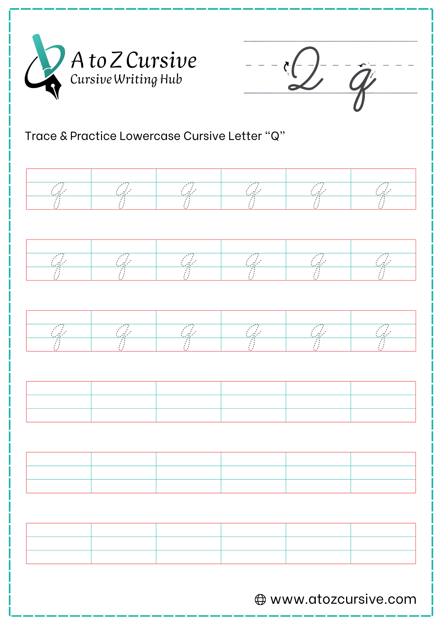
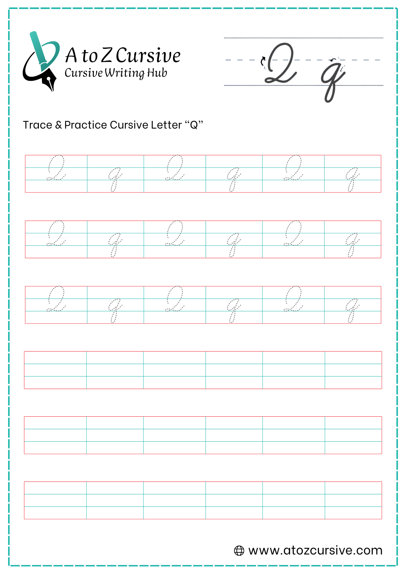
Lowercase Cursive Q
-
Start at the baseline and sweep up to the midline, then curve back around to the left to create a circle (just like starting an "a," "c," or "o").
-
Bring the stroke back up to the midline to close the circle.
-
Without lifting your pen, pull straight down past the baseline and into the descender area (the basement).
-
This is the most important part! Unlike the letter "g" (which loops to the left), the "q" loops to the right. Curve the tail toward the right and back up to the baseline.
-
Once the loop touches the baseline, flick the stroke out to the right to prepare for the next letter.
The Point of Contact: Your backward loop should ideally touch or "point" at the baseline exactly where your vertical downstroke crossed it.
The "u" Connection: In English, "q" is almost always followed by "u." Practice the transition from the "q" exit tail directly into the upward stroke of the "u."
Keep it Narrow: The descender loop should be relatively thin. If it's too wide, it can look like a disorganized "f."
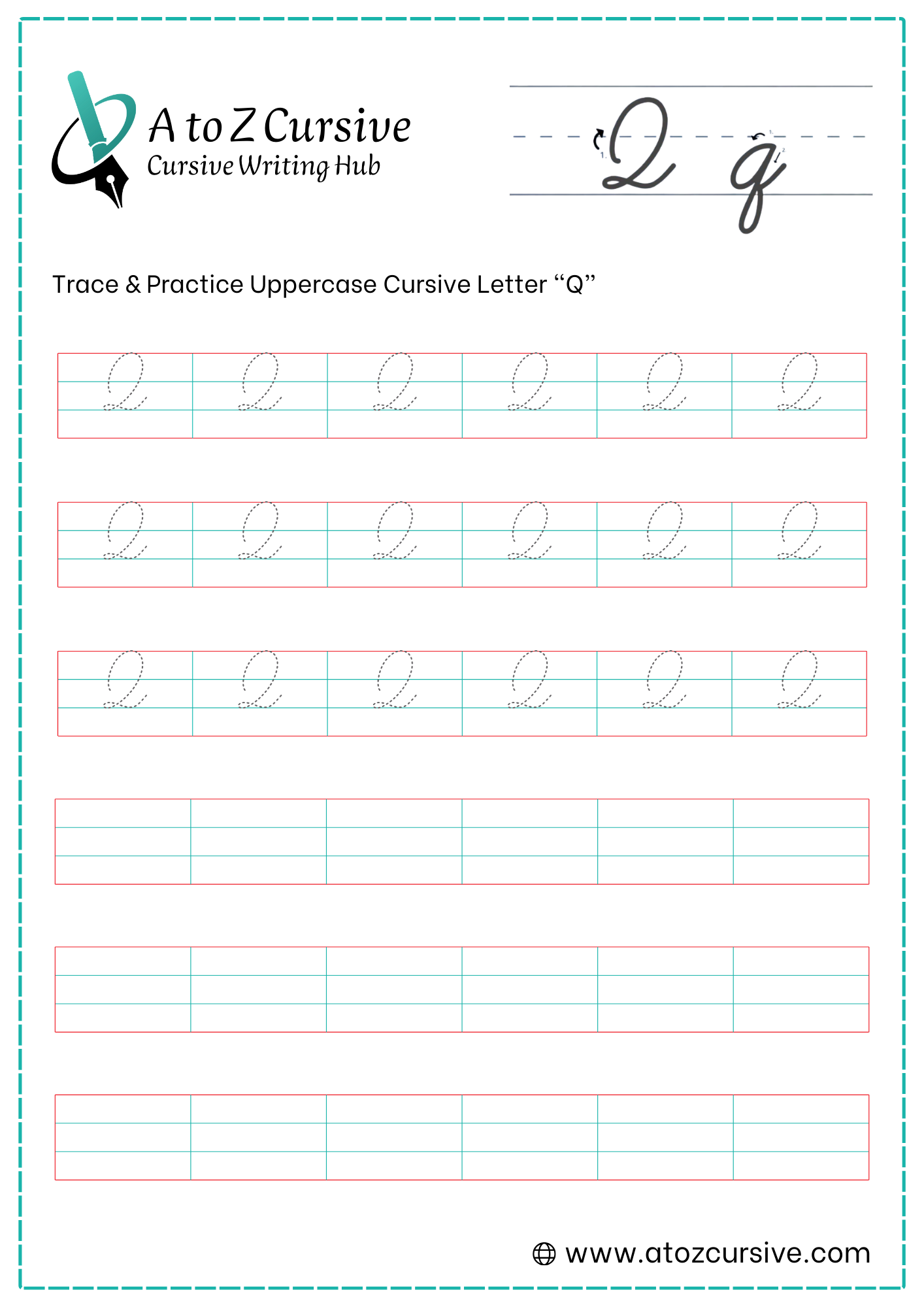
Uppercase Cursive Q
-
Begin at the top line. Pull your pen straight down (with a slight rightward slant) until you hit the baseline.
-
Start just below the top line. Sweep upward to the left, curve around the top, and then head down toward the midline.
-
Continue your stroke down toward the baseline with a slight rightward slant (the "neck" of the 2).
-
As you hit the baseline, curve sharply to the left to create a small, flat loop that sits right on the line.
-
Pull the stroke out to the right across the baseline. This creates a "tail" that is perfect for connecting to the next letter.
Think "Large 2": If you get stuck, simply write a very elegant, slanted number 2. In most cursive styles, they are identical.
Keep the Base Flat: The loop at the bottom should be horizontal and sit directly on the baseline. This keeps the letter stable and prevents it from looking like it's "falling over."
The Connection: Unlike the uppercase "O" or "P," the "Q" is very easy to connect to the next letter because it ends at the baseline.
Proportions: The top loop should be larger and more rounded than the bottom loop to give it a balanced, professional look.
FAQs
The easiest way is to start with an “o” shape, then pull a straight line down and loop the tail to the right.
Lowercase cursive Q loops to the right, while cursive G loops to the left below the baseline.
Yes, lowercase cursive Q has a descender that goes below the baseline and loops back up to connect.
Finish the Q at the baseline and flick the tail to the right, which connects smoothly to letters like “u.”
Yes, uppercase cursive Q ends at the baseline, making it easy to connect to the next lowercase letter.
Avoid looping the tail to the left, making the descender too wide, or not closing the oval properly.
Yes, tracing worksheets help beginners learn proper stroke order, loop direction, and letter spacing.