- AtoZ Cursive
- Cursive N
Cursive N: Tutorial & Printable Worksheets (Uppercase + Lowercase)
On this page, you’ll learn how to write the uppercase and lowercase cursive N. Download free printable worksheets to practice and improve your handwriting step by step.
How to Write N in Cursive
Master cursive N easily! Follow simple, flowing steps to write both uppercase and lowercase letters neatly and confidently.
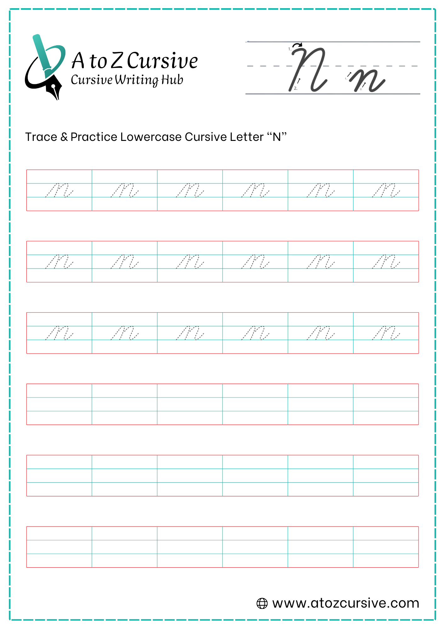
Lowercase Cursive N
-
Start your pen on the baseline. Sweep upward and slightly to the right until you reach the midline.
-
Curve over at the midline and pull a straight, slanted line back down to the baseline.
-
Without lifting your pen, retrace back up that same line almost to the midline. Curve over to the right and pull back down to the baseline.
-
As you touch the baseline for the second time, curve your stroke back up and out to the right. This "tail" is used to connect to the next letter.
Keep it Parallel: Your two downward strokes should lean at the same angle (slanted slightly to the right). This creates a clean, uniform look.
Avoid the "Gap": When you retrace the line to start the second hump, stay right on top of the first line until you are near the midline. If you move away too early, the letter will look like two separate sticks rather than a fluid "n."
Consistent Height: Make sure both humps touch the midline. If one is shorter than the other, the letter can look like a sloppy "u" or "r."
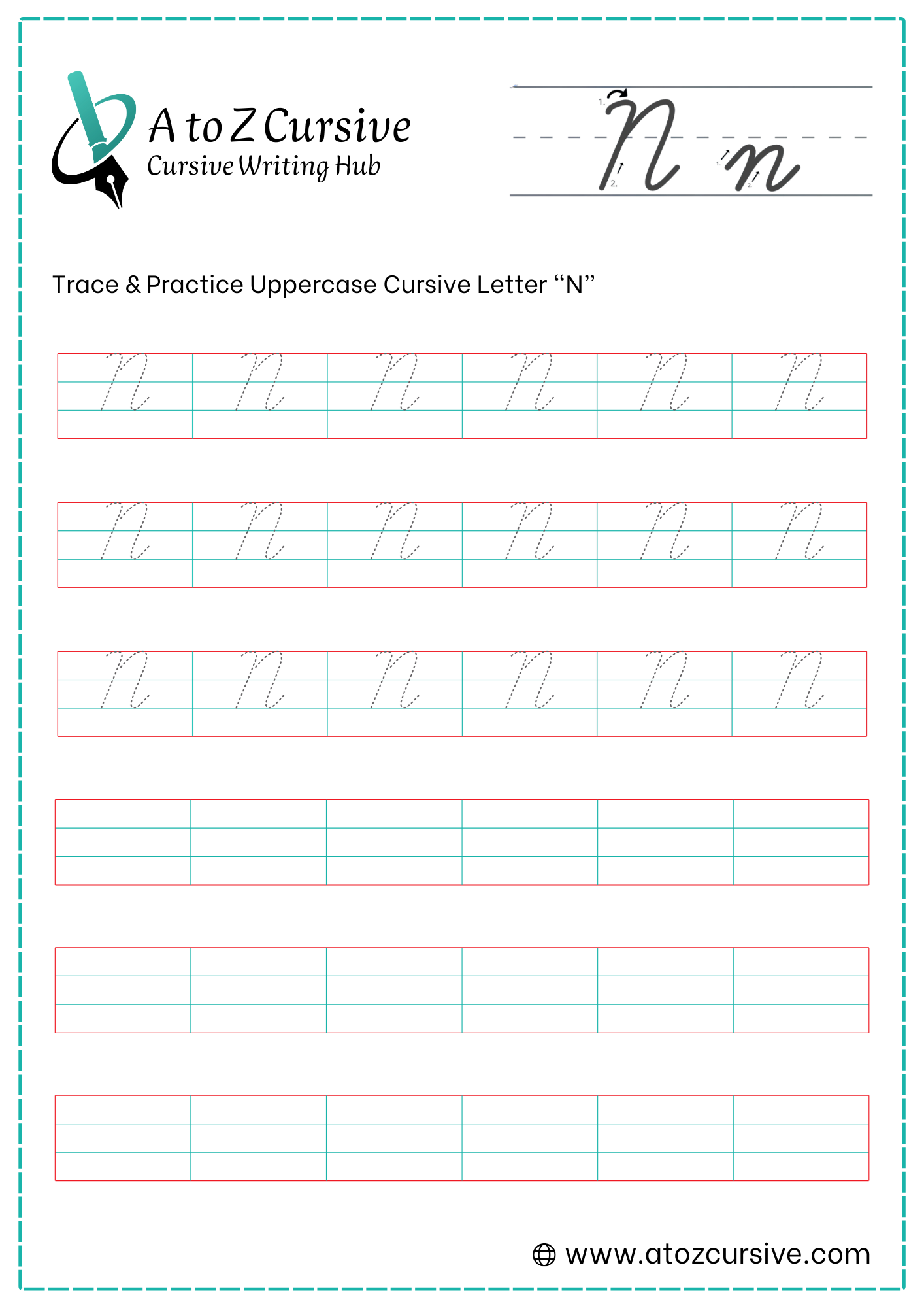
Uppercase Cursive N
-
Start just below the top line. Make a small upward hook or a decorative loop (like a tiny "o") that touches the top line.
-
From that hook, pull your pen straight down at a slight slant all the way to the baseline.
-
Without lifting your pen, retrace back up that same line almost to the very top.
-
As you reach the top line, curve over to the right and sweep back down to the baseline in a smooth, slanted line.
-
As you touch the baseline for the final time, flick your pen upward and to the right to create a "tail" for connecting to the next letter.
Mind the Gap: When retracing the first line, try to stay directly on top of it until you are near the top line. If you pull away too early, the letter will look like a "V" or a "U."
Watch the Width: The uppercase "N" should be about as wide as a capital "O." If it’s too narrow, it looks like a squeezed "I"; if it’s too wide, it loses its elegance.
Parallel Slant: Ensure the first downstroke and the second downstroke are parallel to each other. This is the most important tip for making the letter look uniform.
Height Consistency: The "N" should reach the same height as your other capital letters, like "M," "A," or "P."
FAQs
Learn the entry stroke, two humps, and the exit tail to connect smoothly to the next letter.
Start with a small hook, pull a slanted downstroke, retrace, form a large hump, and finish with a connecting tail.
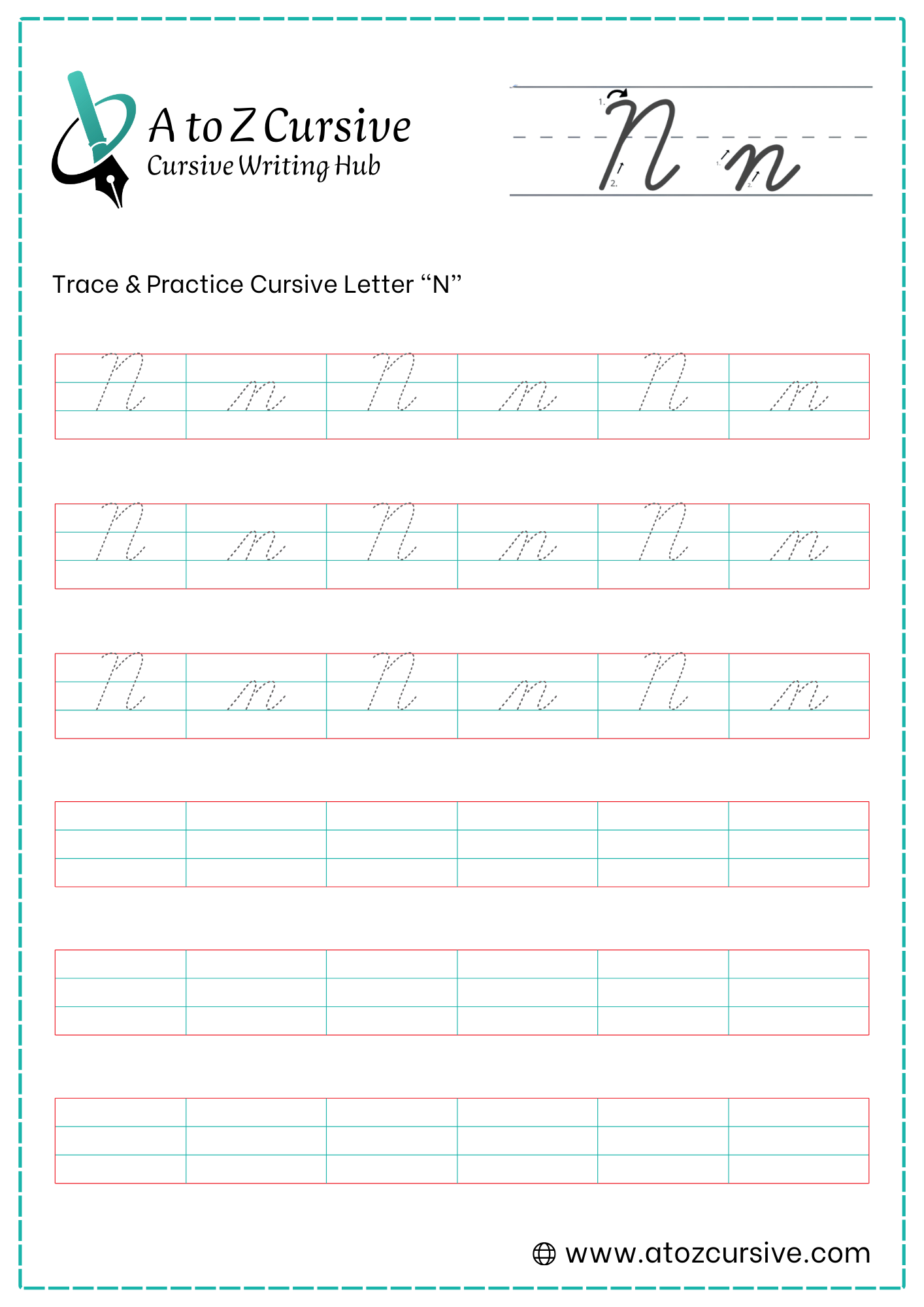
Free printable cursive N worksheets are available to trace, practice, and improve both uppercase and lowercase letters.
Keep both humps or downstrokes parallel, maintain consistent height, and avoid gaps in your retraced lines.
A lowercase “n” has two humps, whereas a lowercase “m” has three humps. This helps distinguish them clearly.
Yes, the exit stroke or tail at the end of both uppercase and lowercase N allows a smooth connection to the next letter.
Common mistakes include misaligned retracing, incorrect width, or slant issues. Ensure parallel strokes and consistent height for elegance.
Absolutely! They provide structured tracing exercises to gradually master letter formation and fluid handwriting.